A stress free travel platform for parents
Working in a team of four, my primary roles involved visual design, ideation of concepts and features, user and domain research and client and user outreach.
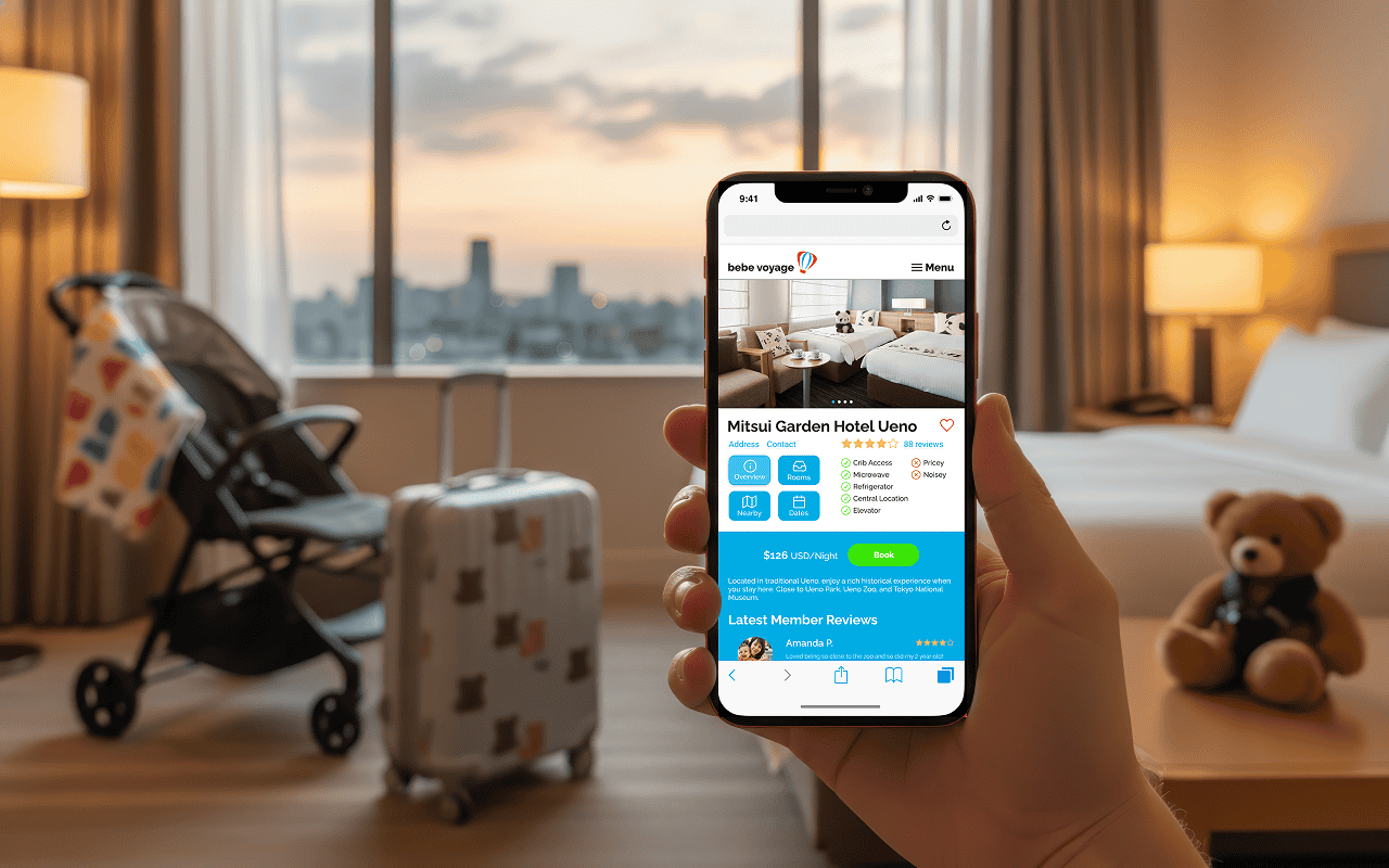
Bebe Voyage, a parent run Facebook community for travelers and their families, wanted a new platform to provide members with information and expand their business.
BBV's main appeal to users came from the sense of community they provided with their Facebook group and its crowdsourced travel information, but this was also a weakness as the info was not organized in an accessible way.
Users complained that the same questions were being asked repeatedly and my design team's job was to provide a new design strategy for Bebe Voyage.
"Our client had a strong preference for an app which utilized geolocation features to view travel itineraries sourced from other parents."
Our design process started by taking a look at BBV's current platform to understand the product better and get a sense of the design values.
Something that my group wondered throughout the early process was whether our client was attached to the idea of building a geolocation app, given that we did not have enough data on whether it would actually address the issue of information accessiblity on the main Facebook group.
We wanted to have all options on the table, in case a different format would be a better fit for the users’ needs.
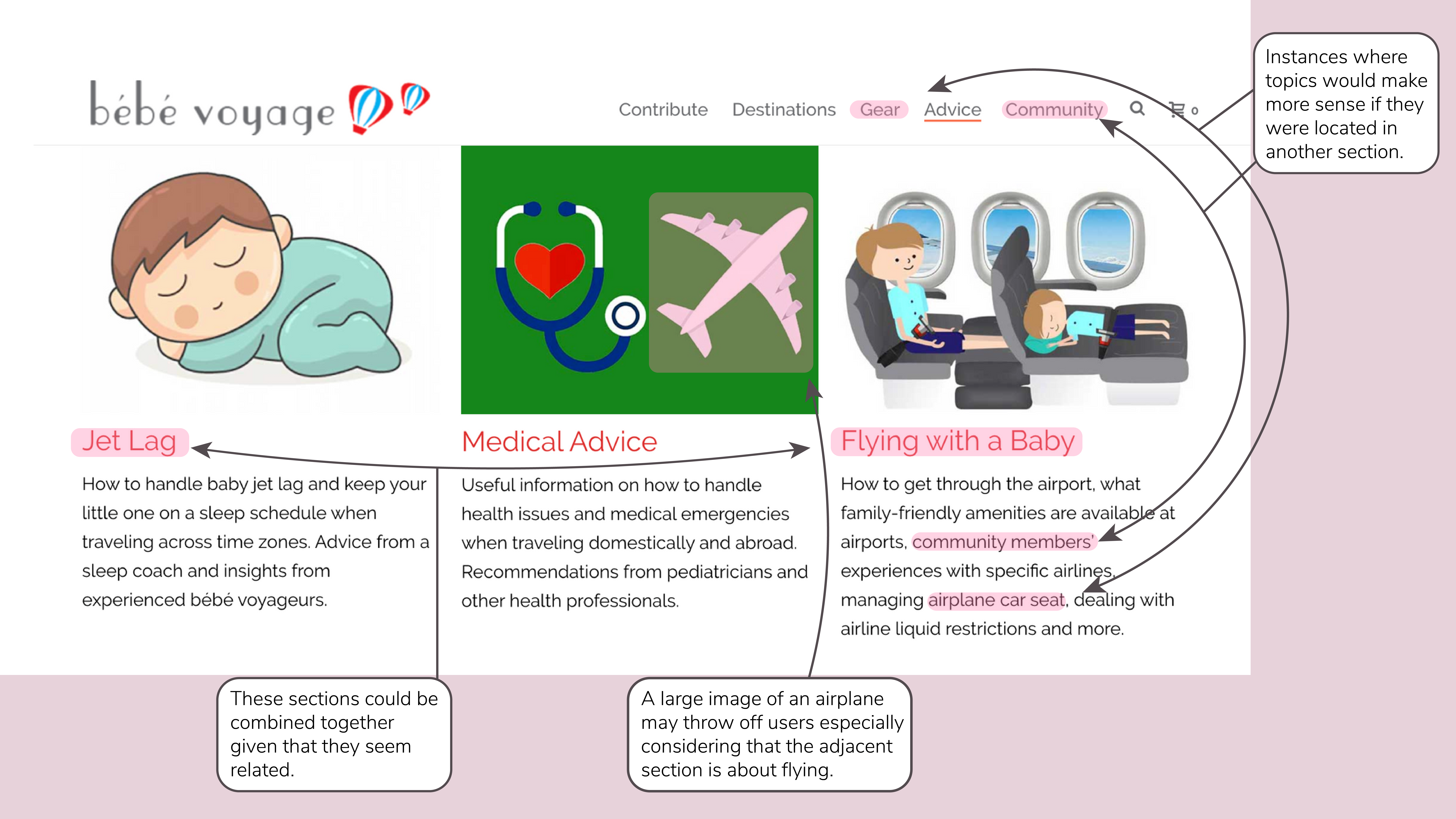
"The website had categories of content that were not labeled and organized intuitively, and had many groups which could be combined, separated or condensed."
We read about our user’s demographic trends in our domain research, but we wanted to get the most accurate data and hear directly from the users what they had to say about the community. Specifically, we wanted to get a better grasp of the following:
After going through a round of user interviews, my team discovered the following trends:
Overall, the users found value from the company because it gave them a space to learn from the previous experience of other parents. They could also gain a sense of community through seeing user-generated content such as pictures of families while traveling.
It came to our attention that a centralized source of information needed to exist outside the Facebook group, which had become bogged down by repeated questions.
To visualize the key traits of our users, their specific needs, and what could be provided as a solution, my team created a problem statement to determine and summarize the core problem that was to be solved by our minimum viable product.
"Uncertain and curious parents need community-sourced guides composed from the experiences of other parents to minimize unexpected problems during travel."
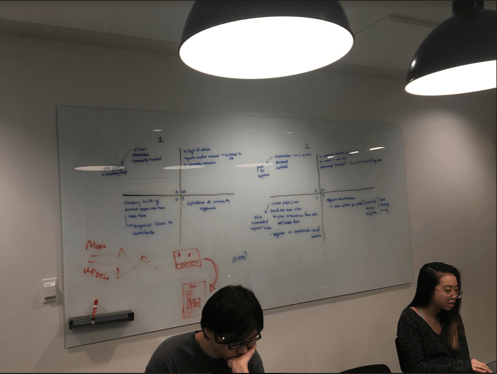
After reviewing our interview findings, we needed to make sense of the problem at hand and the evaluate cards we were dealt.
Our client currently had two platforms, the first a Facebook group with a high number of reposted questions, the second a website with a high bounce rate, and were exploring creating a third platform.
My team decided that the main objective to pursue was the creation of a highly accessible parent-sourced space for BBV members. Additionally, we needed to find a way to cut redundancy from our client's organizational system if we wished to properly address the user problem.
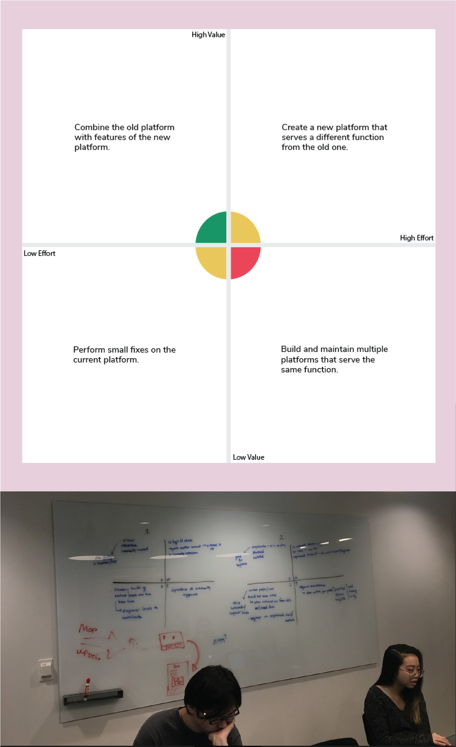
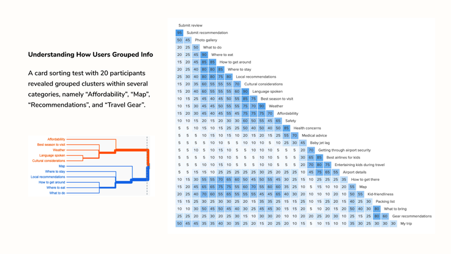
"Before ideation, my team went through several exercises and thought experiments to determine how we should best tackle the problem with the limited time we had."
We started asking questions about how we could create a concept that would incorporate features that best assisted in solving the problem statement.
The following user centered design principles were our north star:
Comprehensive Portal
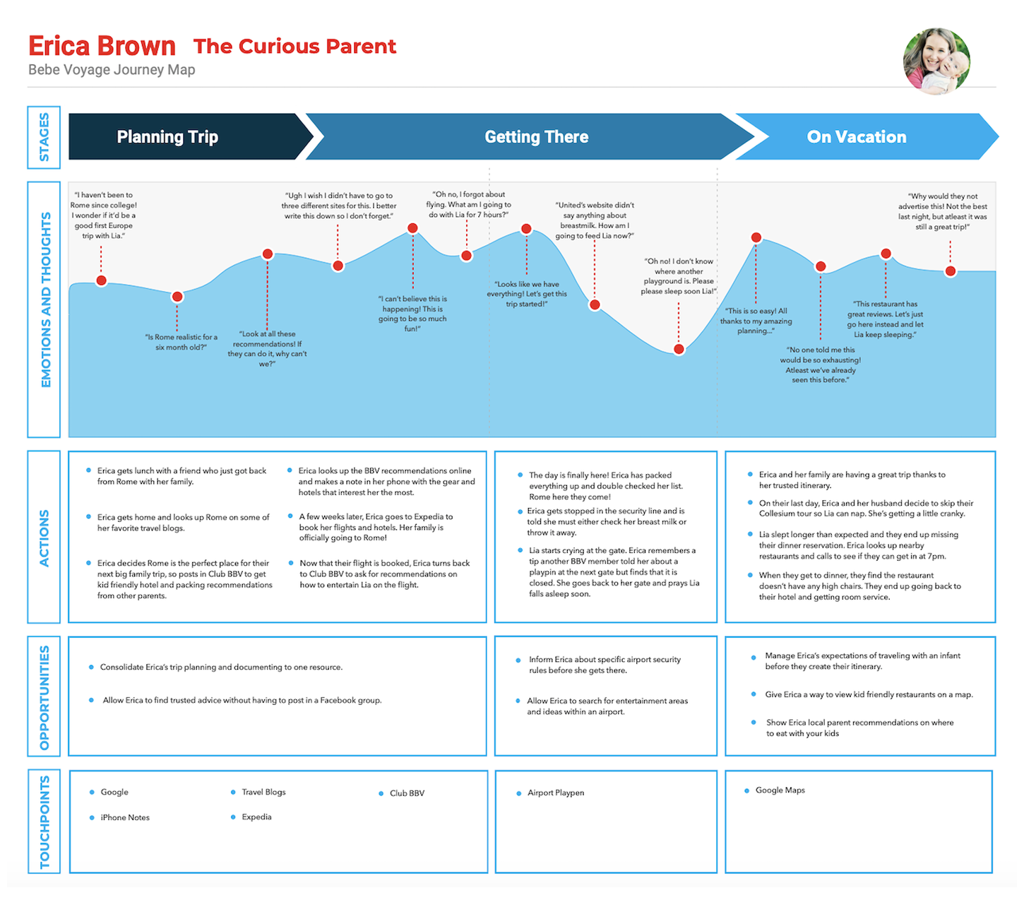
BBV users, as personified by Erica, wanted one source for all their travel needs. Instead of going to Amazon to buy travel products, Expedia to browse and book hotels and LonelyPlanet to view travel guides, how could we bring the experience of all three into one condensed platform?
Streamlined Interface
From our research, we found that the majority of BBV users favored mobile devices. How could we present content in an easy to understand way? How could we create a simple interface that would enable users to do more while traveling?
Finely Curated
Traveling is never a clear cut process. Destination, individual needs, even things like geopolitical climate can greatly alter the experience between people. With that in mind, how can we best curate information for each BBV user?
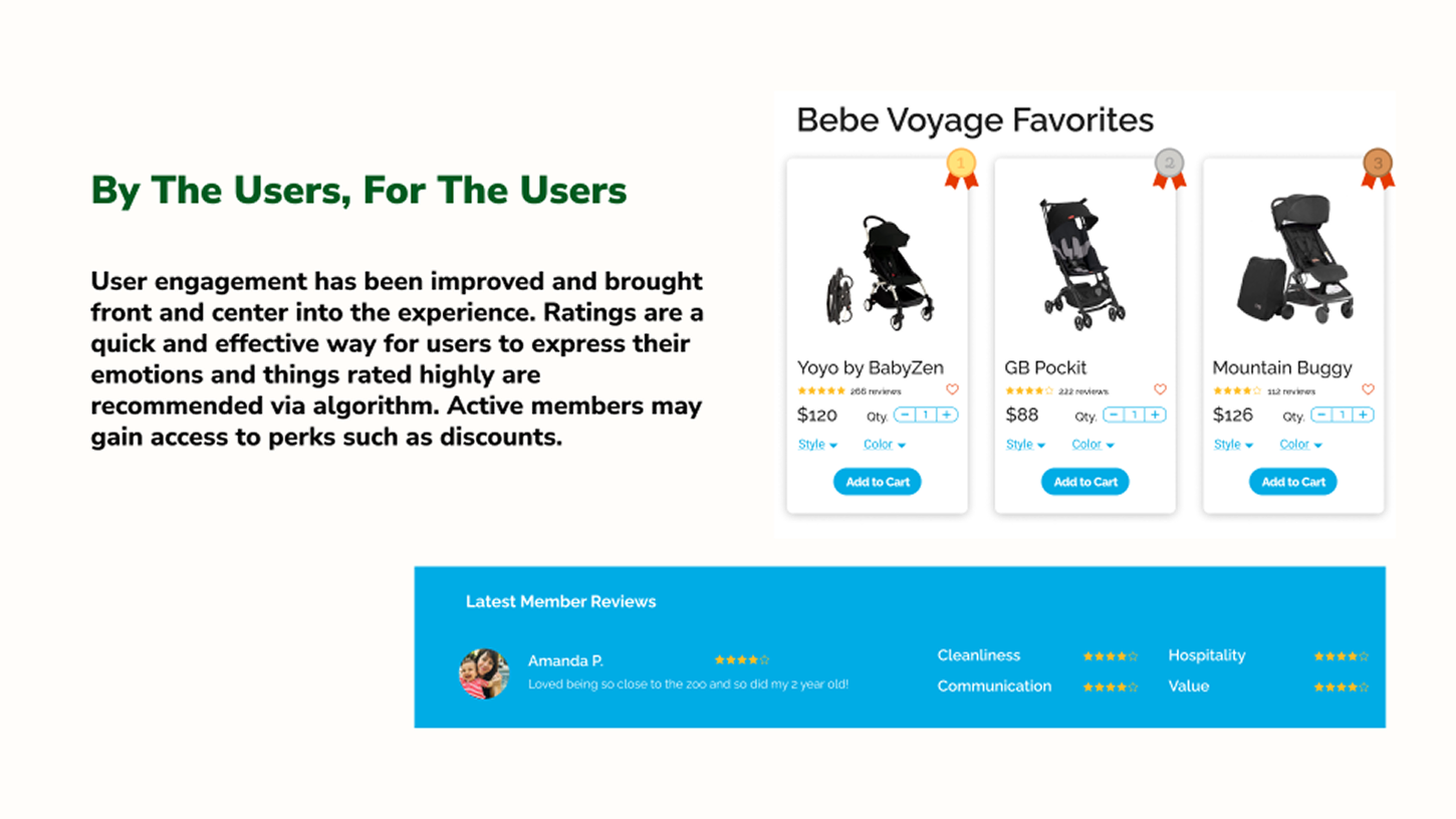
By The Users, For The Users
BBV members felt comfortable knowing they recieved guidance from another parent. They also loved seeing photos of other members’ travels. How can we display user sourced content effectively and also incentivize users to contribute knowledge?
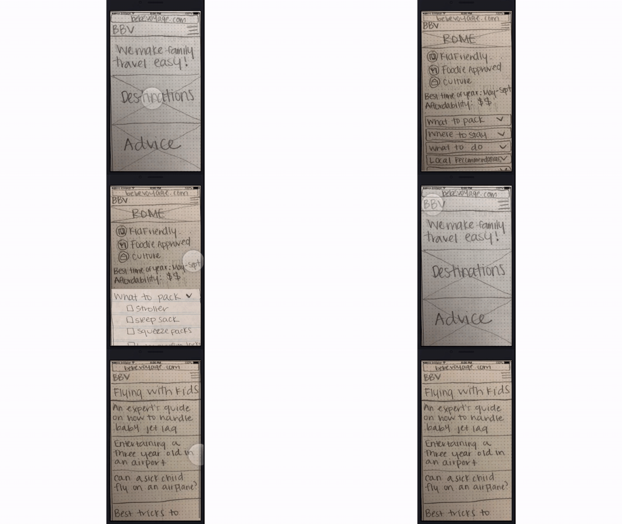
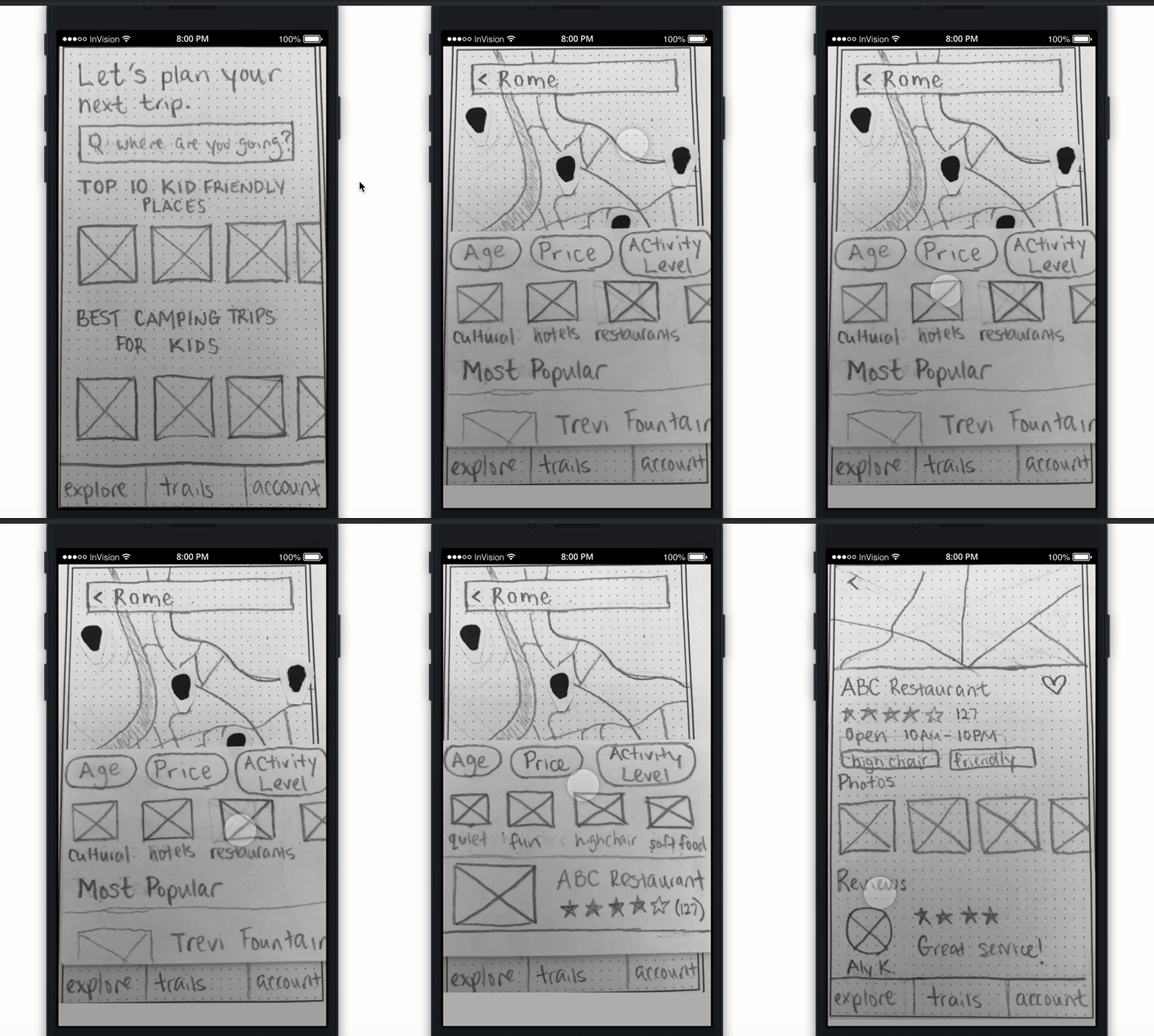
Two concepts were created with paper prototypes on InVision. The first was a mobile app that provided users with information through a map and the second was a responsive website redesign that categorized content more efficiently.
First concept: We decided to address the client’s original desire for a mobile app featuring geolocation.
Second concept: A redesign of the current website to modernize the UX design and Information Architecture.
The reason we made the second concept a website redesign was because the current website was not up to the users' standards as a place to get information and it would make more sense logistically for the company to rework what they had in place than to scrap it for an app.
A third concept utilizing a message board similar to Reddit was ideated but dropped because it was deemed as not providing much more value than what was already in place.
We spoke with users again, this time testing our concepts as well as the current website content to draw a contrast in our results.
To supplement our tests with a larger dataset, we also surveyed the BBV online community on which concept they preferred.
Our results showed that users visually liked the mobile map concept better than the website redesign.
"Many of the same interviewees who liked the mobile app better also stated that there was a need for a website to consolidate information."
We decided to converge the concepts into a responsive website that utilized a map because the users reacted positively to both ideas and it would address information accessibility concerns by slimming down the client's underleveraged channels of communication. Our client gave approval to proceed after we explained our reasoning to them.
The next step would be to turn our converged concept into a minimum viable product to be tested with users again as a mid-fidelity prototype.
Content formatted as tiles for easier visualization.
Pros & cons as well as ratings placed in visible location.
Accordion format used to neatly organize content.
We needed several questions answered to deem if our prototype successfully solved the problem statement.
We created three tasks which would be tested with BBV users to see how well our design solved the issues.
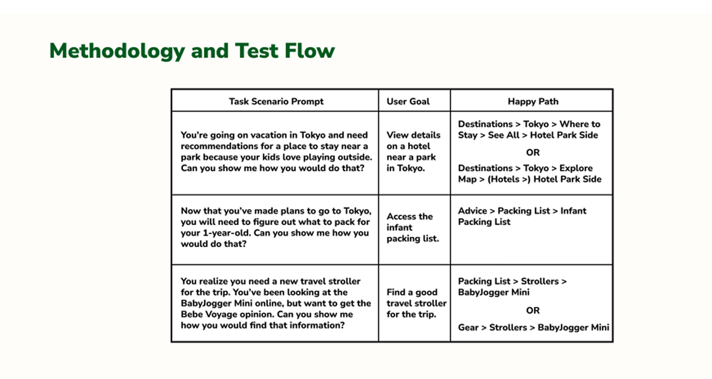
Use the map to find a baby friendly hotel in Tokyo.
Access the packing list to see if there were specific items to bring to the trip.
Use the redesigned content page to find a new baby stroller.
The results for the usability came in and were positive overall. Our tested users said that they felt the information they were looking for in our prototype was intuitive to reach. They remarked that the ability for members to leave and read reviews on the website made it feel like they were in a place that they could trust to help them out.
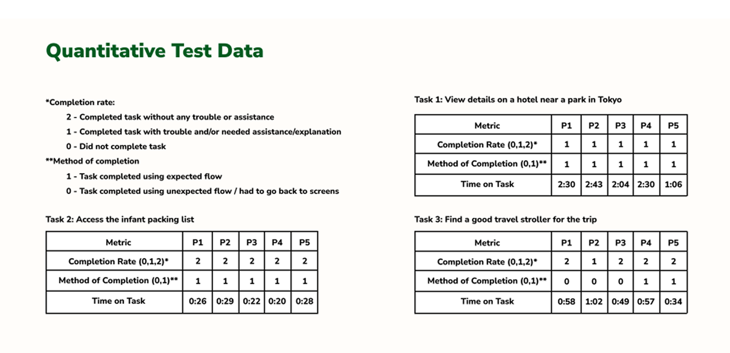
Of users completed all tasks.
The average ease of use rating.
The average helpfulness rating.
Some common suggestions from users were easy to implement as iterations to our design. This came in the form of revising age group classification, adding a buy button directly to the website and adding “What to Bring” to destinations.
Other suggestions were documented but would require further testing to properly implement. These included greater platform personalization, standardizing content and better utilizing geolocation for engaging family activities.
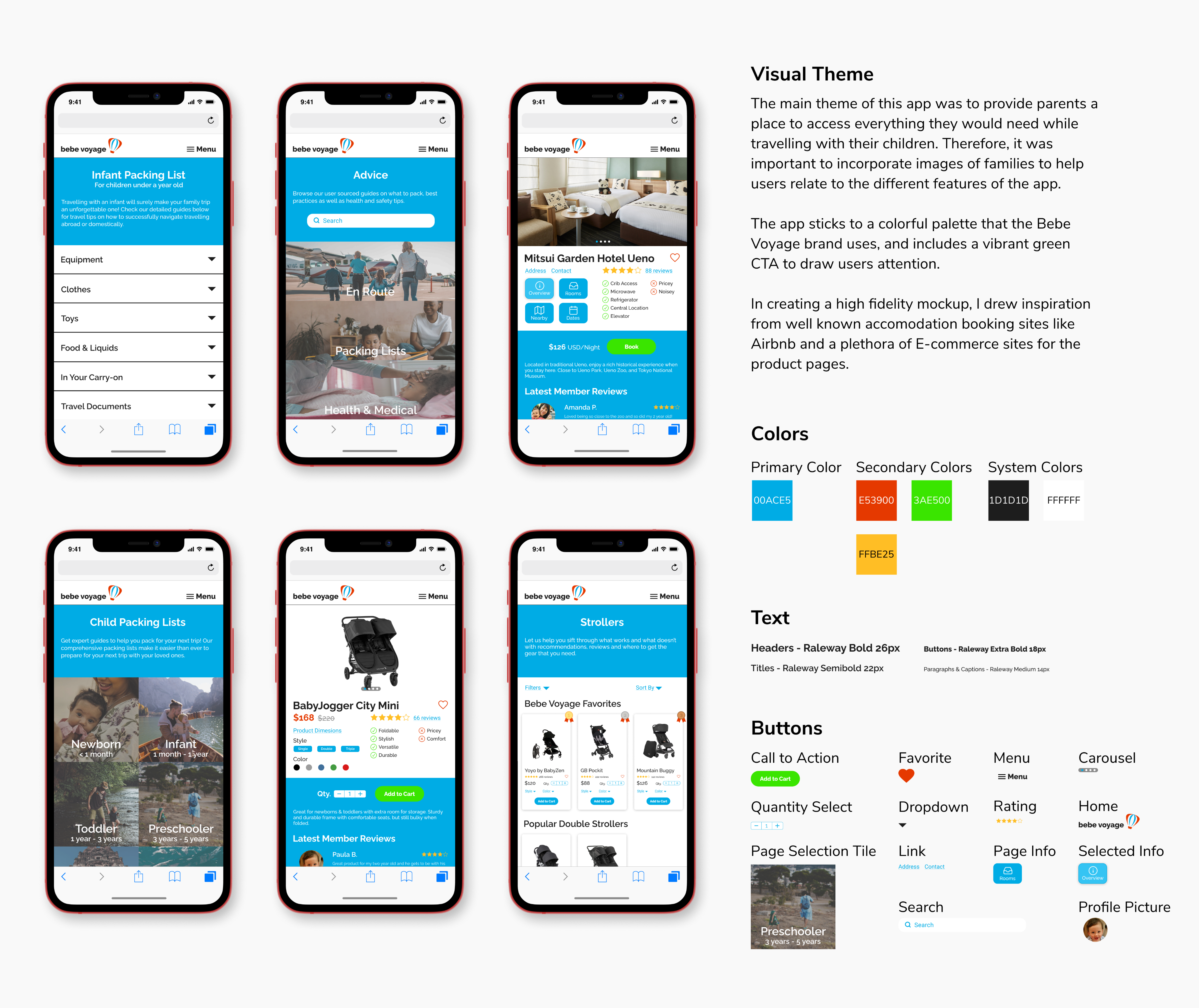
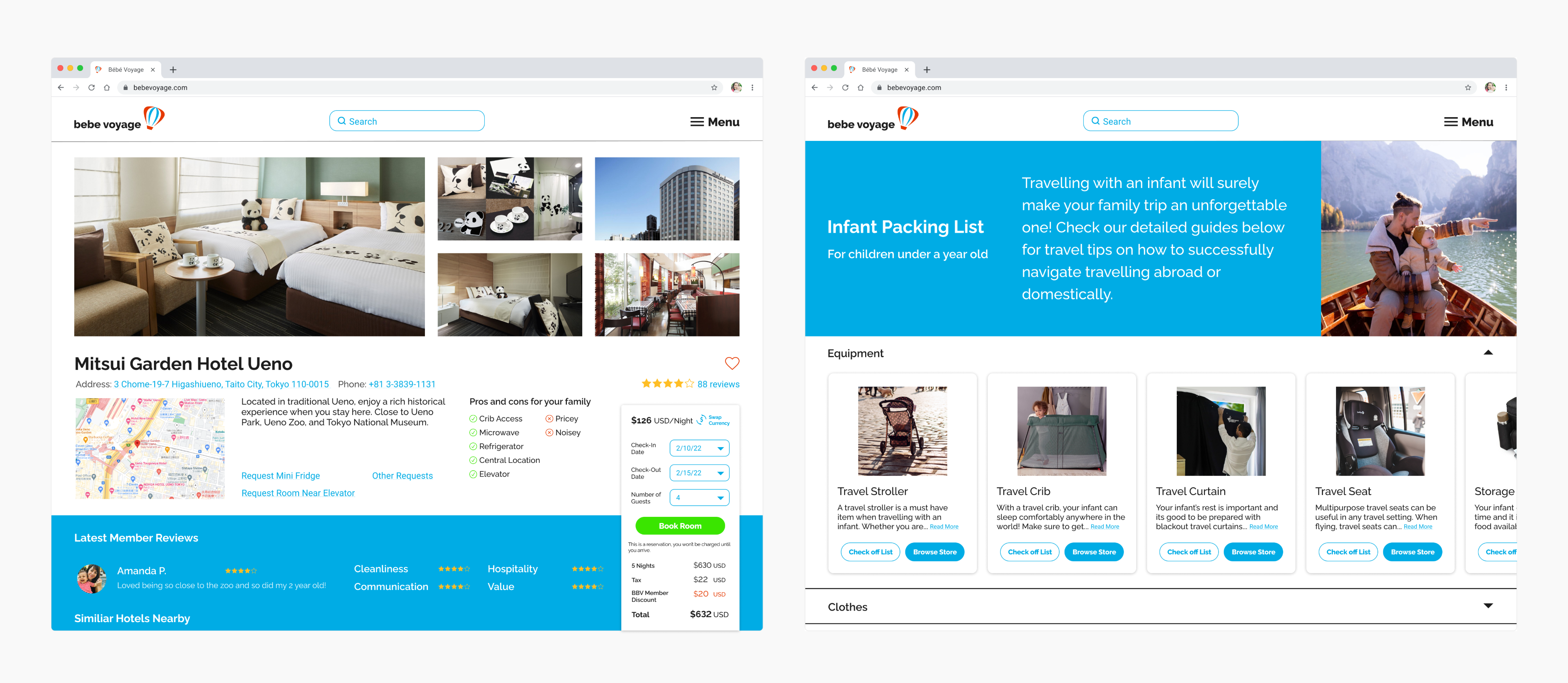
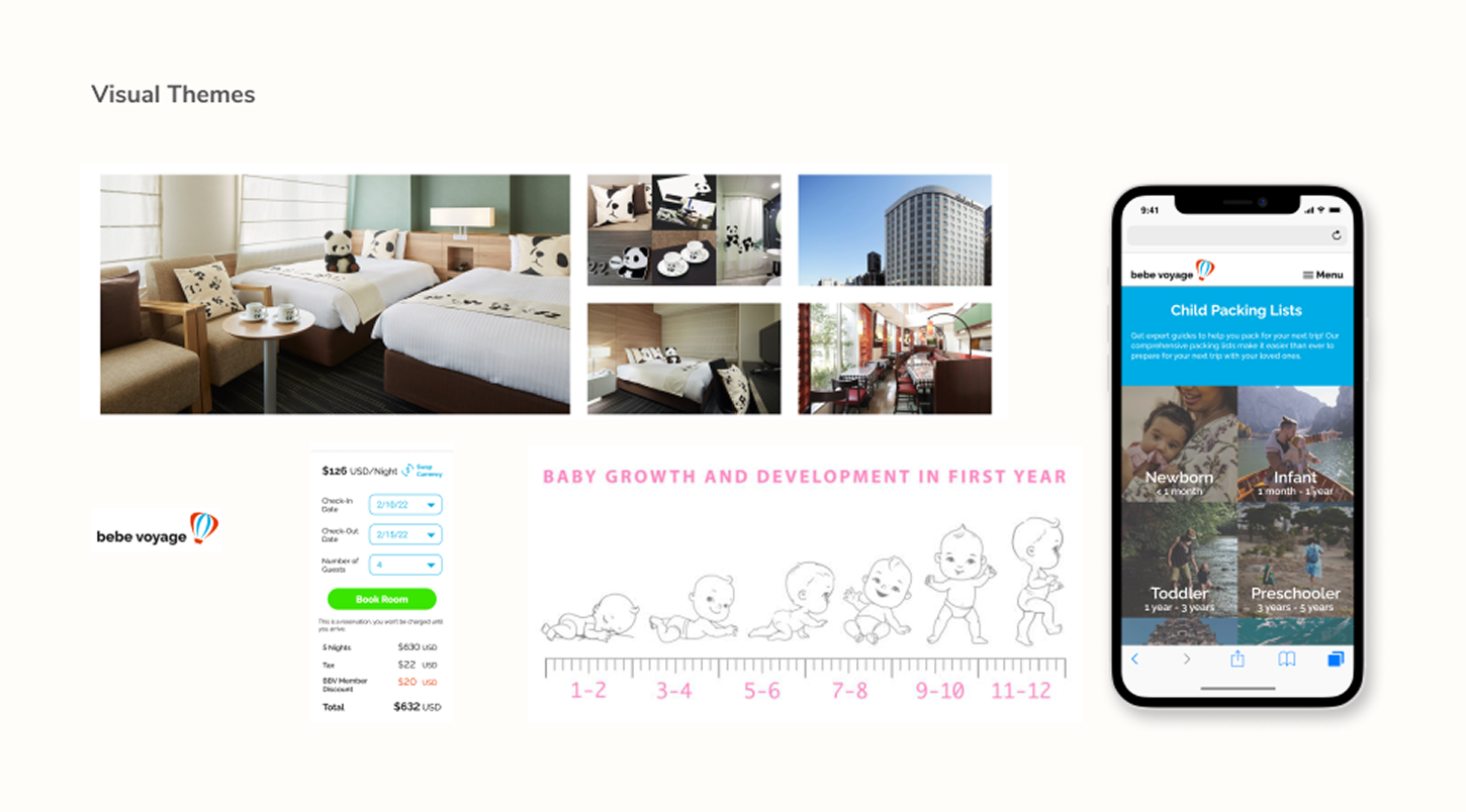
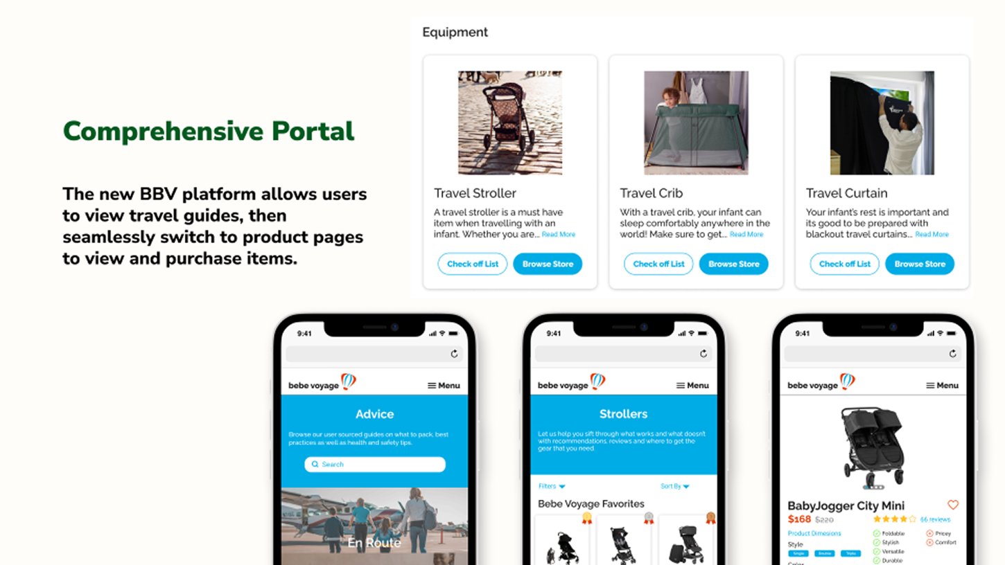
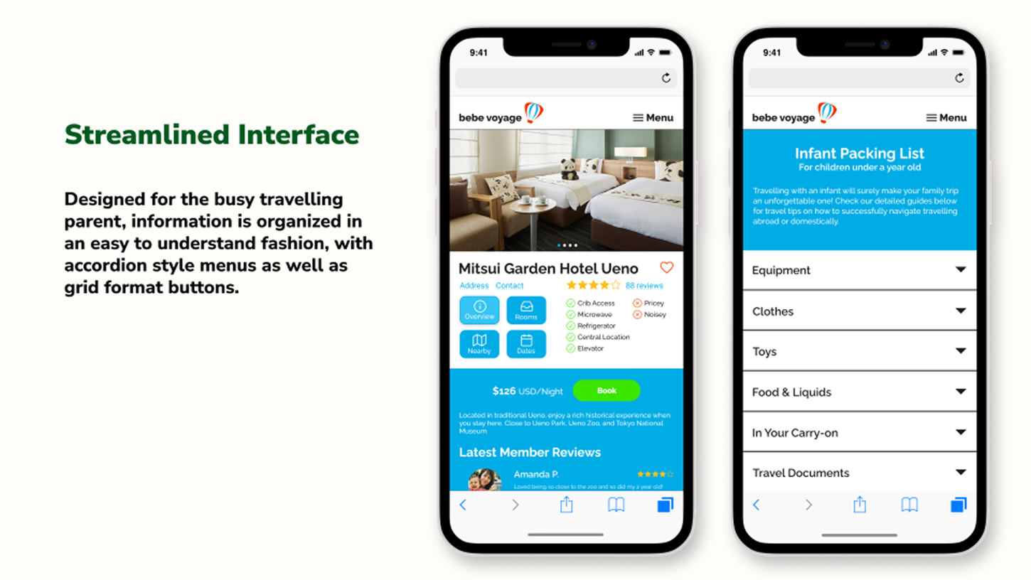
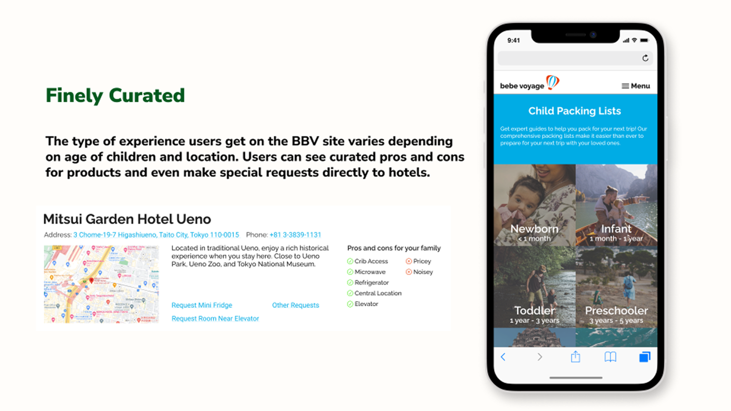
With our mobile website redesign, we created a platform that was easy for users to navigate through both a visual map and text-based formats, provided the information they wanted to learn about their travel needs, and still provided elements of personalization as well as user engagement.
In our final hand-off for reference, we included an executive summary to define what each deliverable was for. Because we deviated from the original idea of an app, we needed to provide documentation in detailing project decisions, such as why we chose to create a responsive website and how the client can refer to each deliverable our hand-off.
This project helped me grow as a designer most in terms of gauging what users prioritized in a product, and how to prioritize features in an MVP. It helped solidify the notion that the first solution is not always the best solution. Although we had a solid grasp of who we were making the product for, it took three rounds of user interviews and testing to determine our MVP. The experience made me grow as a professional, as I was able to juggle the clients' requirements in a diplomatic way.
Our client came out of this partnership happy because we were able to offer alternatives to their original plan that users loved. They implemented many of the IA and visual designs we suggested and internal testing 6 months after showed a large increase in website engagement and steady decline in repeated questions on the community page.
