A gamified app to reward park usage
Working in a team of four, my primary roles were concept and feature ideation as well as domain research, with secondary roles in prototype testing and visual design.
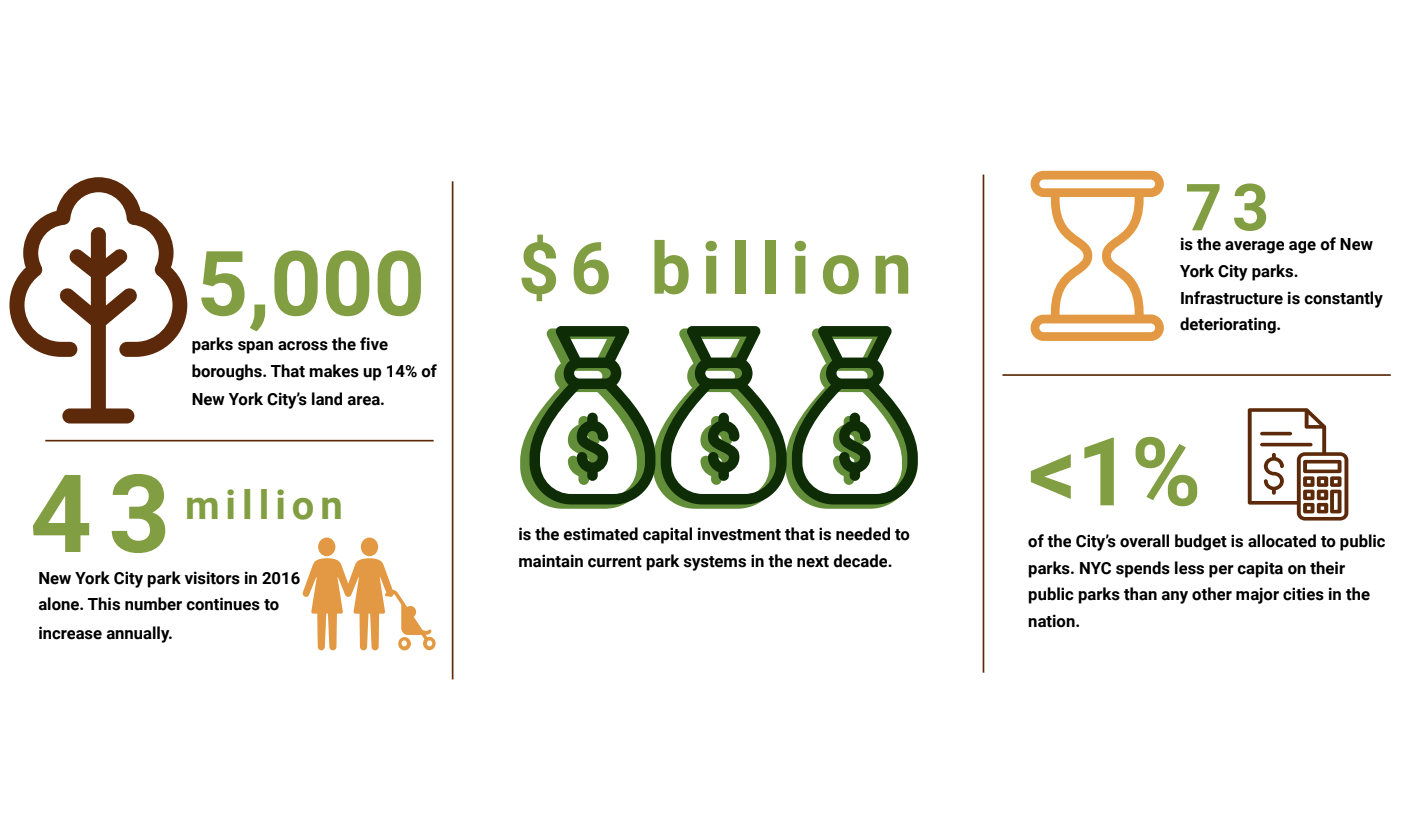
While New York City public park funding has increased by 70 million over the past four years, it still makes up less than one percent of the city’s overall budget.
The Center for an Urban Future recently reported that the average New York City park is 73 years old, with parks in every borough nearing the end of their useful lives. Over the next decade, an estimated $6 billion in capital investment is needed to maintain the current park system.
To revitalize the park system, my team sought out a user centered solution which would which bridge the gap between the community and their public parks. By helping engage and educate citizens, our project could potentially alleviate commonly ignored issues and give users a more proactive role in the development of their public spaces.
"Fixing the main channel of communication between the government and constituents can be the first step towards positive change."
To begin, we examined the current online experience for New York Public Parks. We found that the website was very informative, detailing everything from getting permits to information on facilities, programs and events.
My team and I believed that while this information was useful, there was too much laid out in the open. It did not display information that engaged users to discover, but seemed rather like a necessary chore for people who really needed things like park permits.
Now that we were beginning to understand the problem our design was solving for, our next step was to speak to park goers, our most likely user, and understand them better. Before jumping in to ideation, we needed to have a firm understanding of:
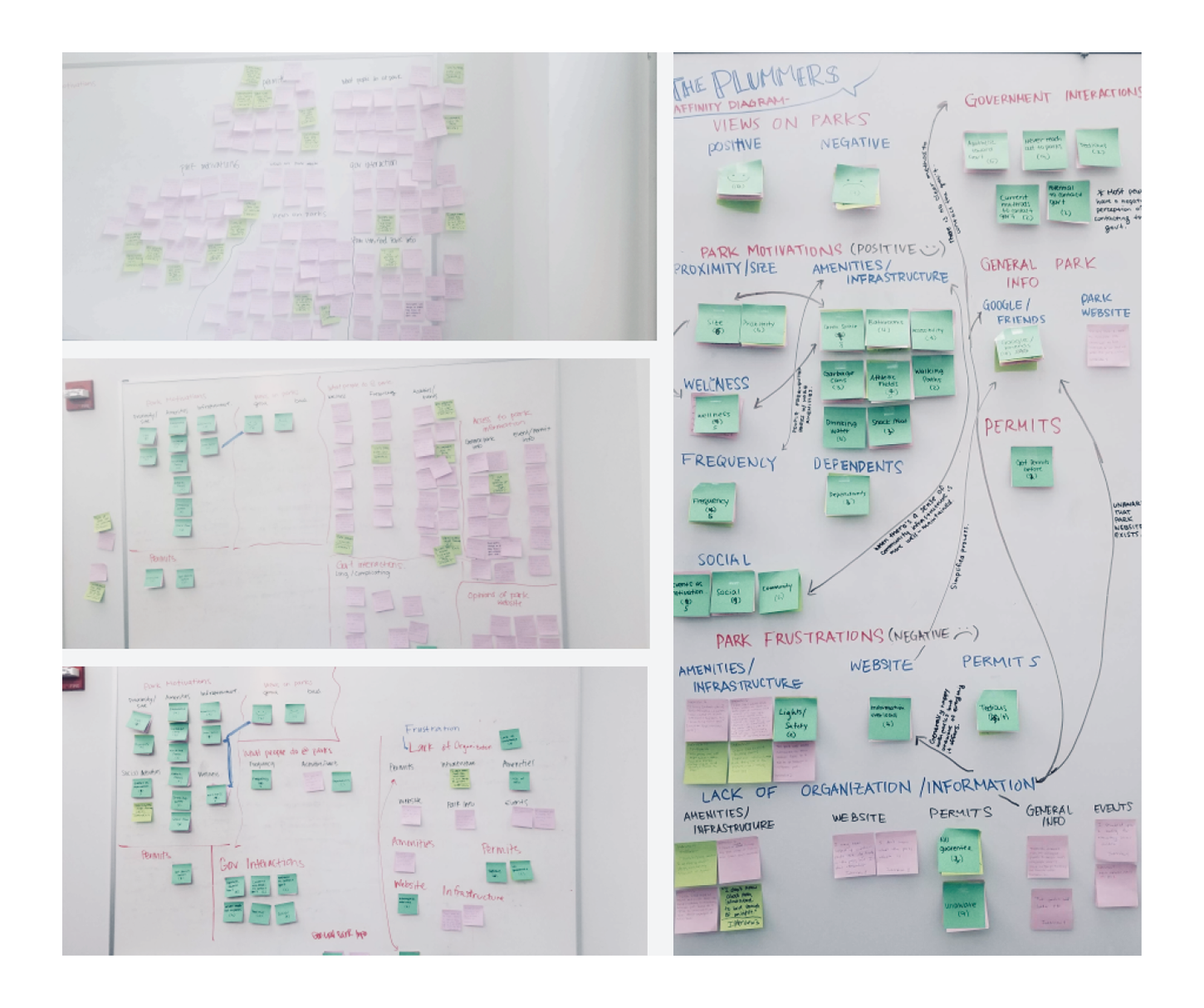
We reached out to New Yorkers, though both referral and guerrilla interviews in the local parks, and found about half a dozen interview candidates. From there, we found three major trends:
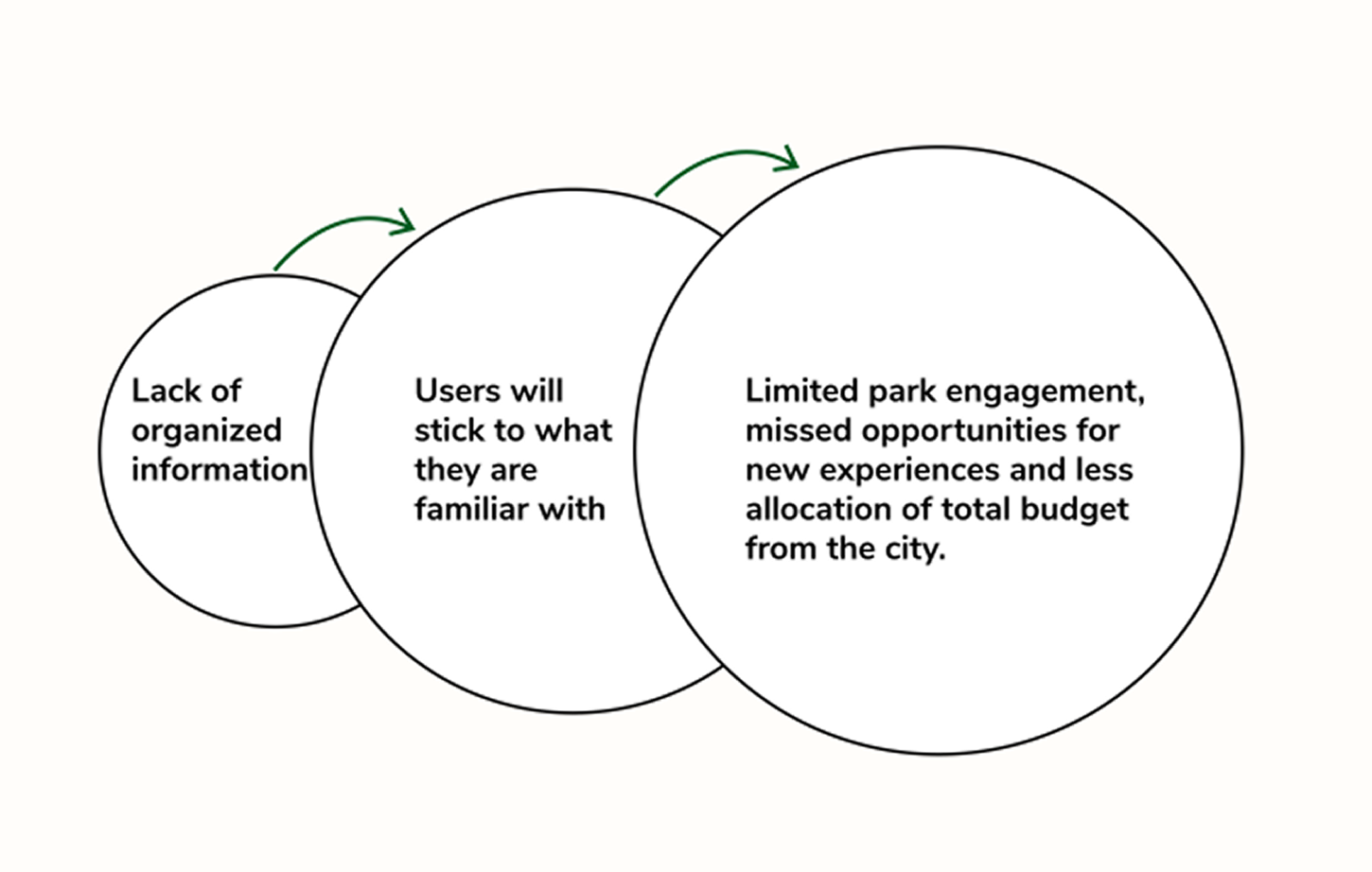
An underlying theme to our interview responses was that most of the people interviewed were curious about exploring other parks and events and were willing to be more proactive with helping their community. However, they rarely ventured out of the comfort zone, typically sticking to the parks that were most convenient. Finding actual locations within the park such as restrooms tended to be troublesome in unfamiliar parks.
The problem was that there were few incentives laid out clearly to them. It seemed like the state of the official park's website was actually a disincentive to explore because of how overwhelming it was. What this led to, we theorized, was a cycle of apathy, where the lack of incentives explore led to people feeling stuck and sticking to what they know. This causes degradation of public parks, as most NYC park-goers would rather avoid and ignore broken utilities such as water fountains and benches rather than reporting them.
With these insights in mind, we were getting a clearer picture of the user and what the users might appreciate in an online park platform. We created a problem statement summing up our findings and setting up the next stage of solving the problem.
"NYC park-goers feel lost when looking for amenities or events within the park and need a streamlined way to locate information because current resources do not fully equip them to explore unfamiliar areas."
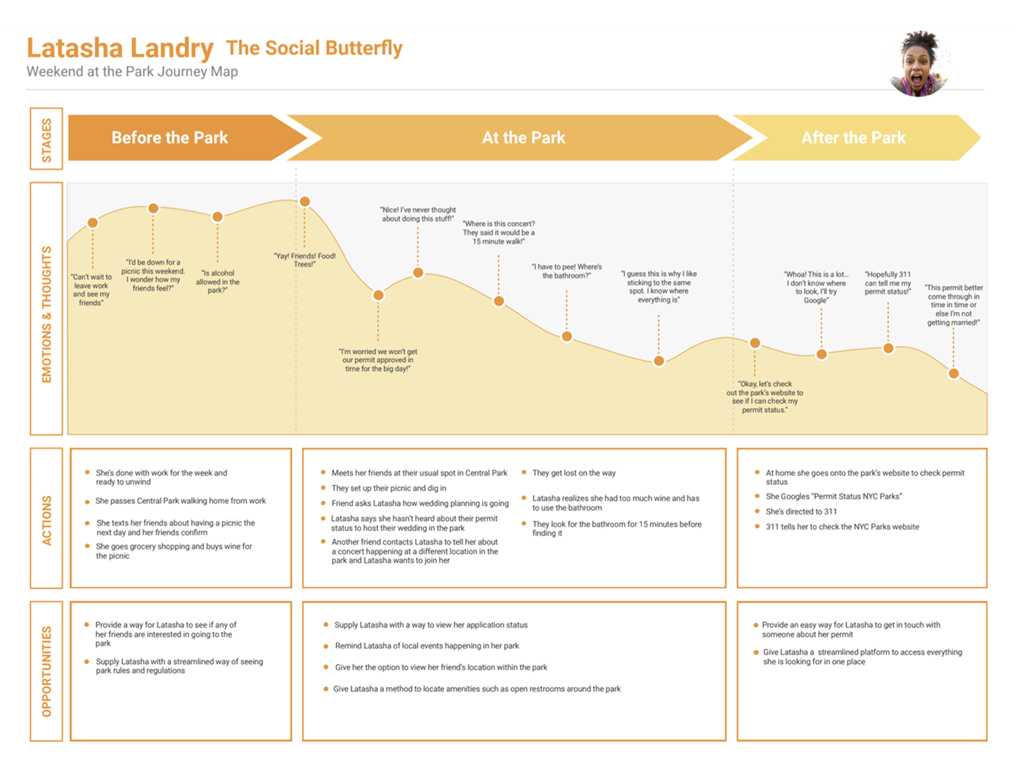
"Worried about a myriad of issues, ranging from finding restrooms to getting information on a permit, the problems of our fictional heroine led to several opportunities."
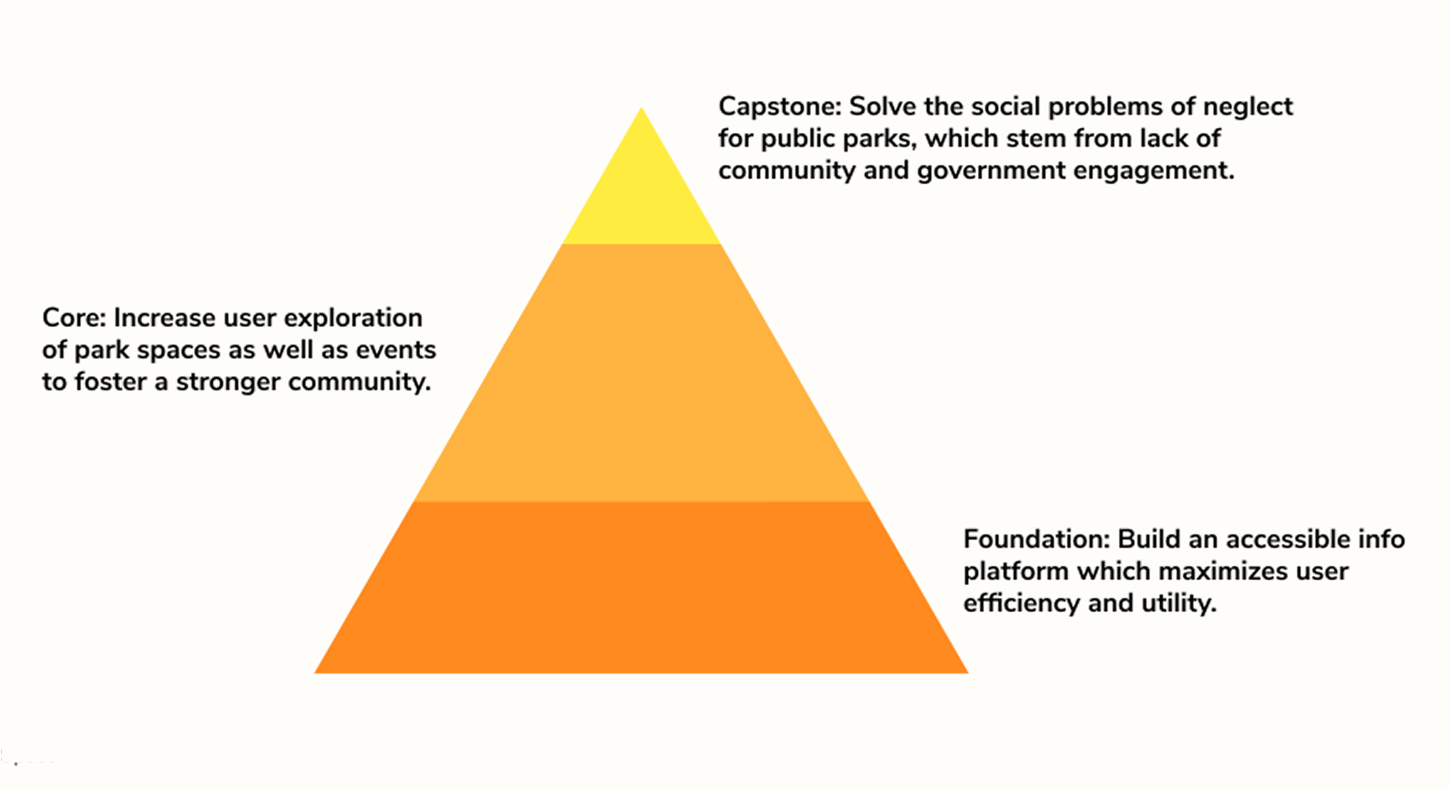
Before ideation, we kept in mind two core issues that all of our ideas should attempt to solve:
The following user centered design principles were our north star:
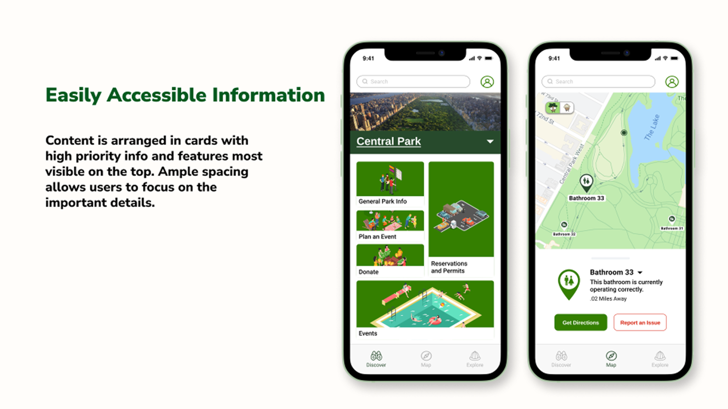
Easily Accessible Information
We learned from the research that NYC park visitors often feel lost when trying to access relevant info like park permits, amenities or facilities. How might we organize these complex tasks in an easily accessible way?
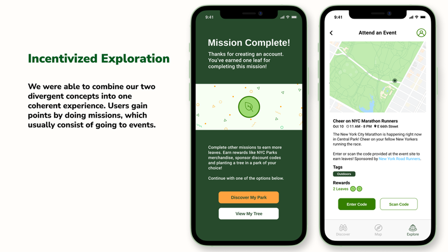
Incentivized Exploration
Our persona, Latasha, like many people we spoke to, expressed discomfort in exploring unfamiliar territory. How might we break negative perceptions of exploring spaces and turn it into something that is fun?
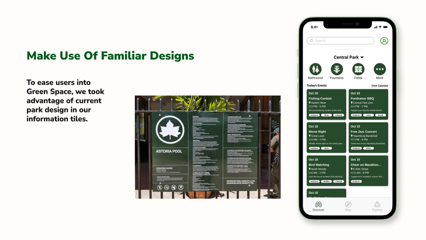
Make Use Of Familiar Designs
Another way to minimize user confusion is to make the experience as familiar as possible. How can we utilize imagery and systems that are already familiar to the user to improve navigation?
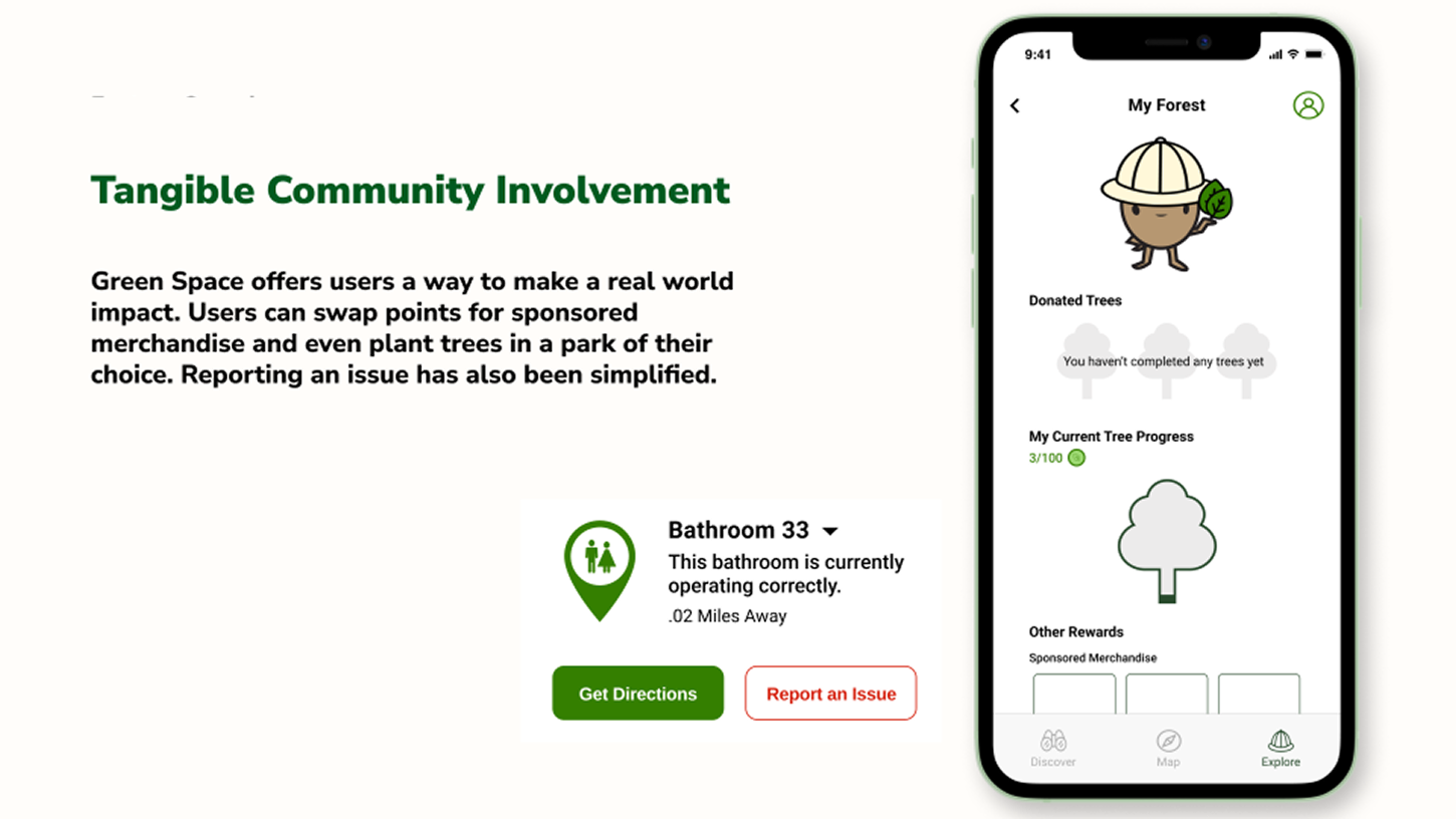
Tangible Community Involvement
Researching public data as well as talking to New Yorkers uncovered deep systemic issues in funding, civic engagement and infrastructure. How can our solution break the cycle of apathy and renew community involvement in a tangible way?
After defining these priniciples, we created three divergent concepts, with each concept addressed a different concern of users.
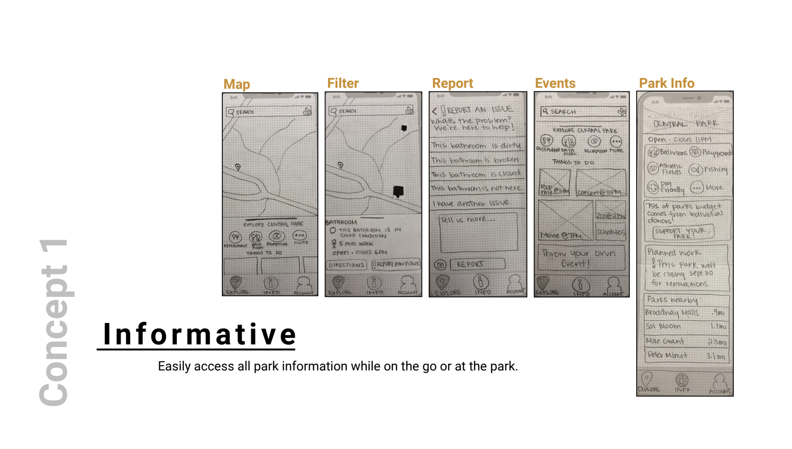
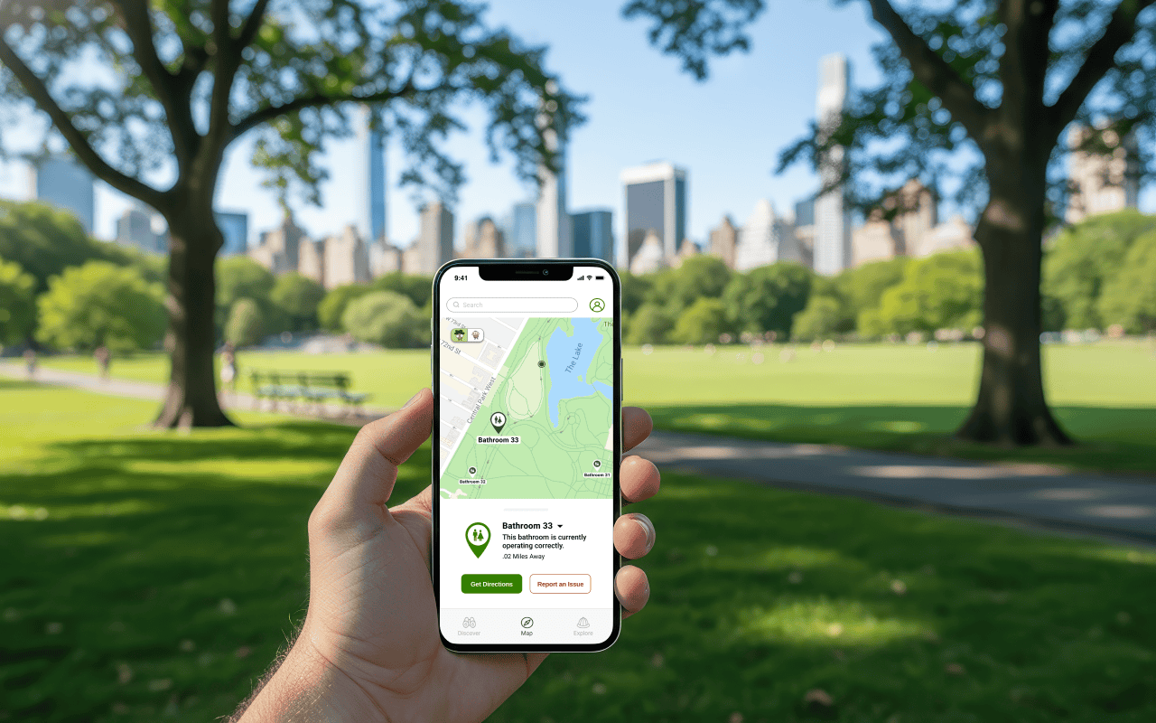
The first concept addressed gathering information within parks with an interactive map of every park within NYC. Information about amenities such as its condition, its distance from the user and its availability would be displayed and users would no longer have to worry about finding things within the park itself.
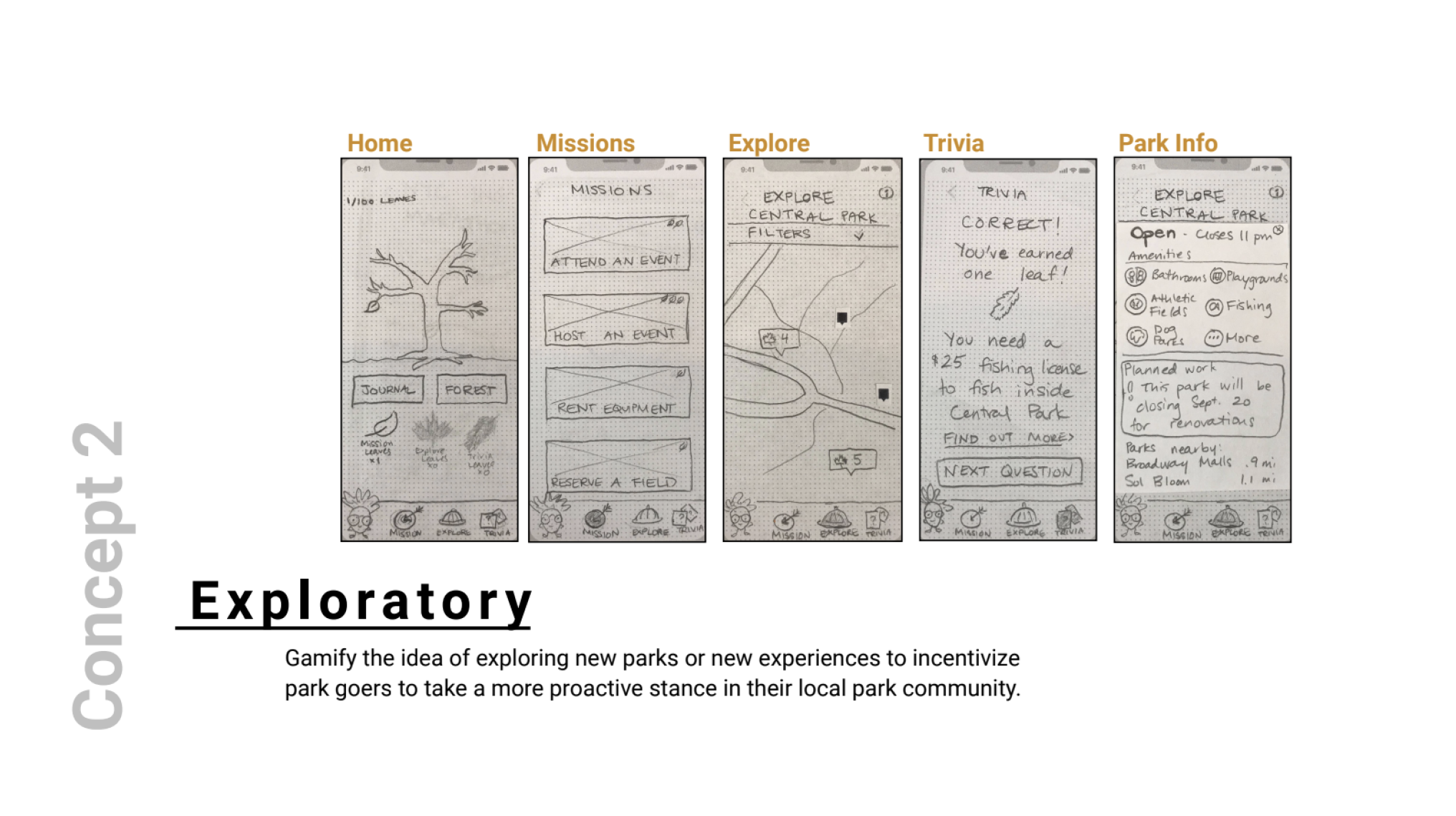
The second concept addressed incentives to branch out and explore with a gamified experience. Users would primarily earn points through park trivia quizzes and missions, which would involve going to events. Active users would win prizes, culminating in a tree being planted within a park of the user's choice.
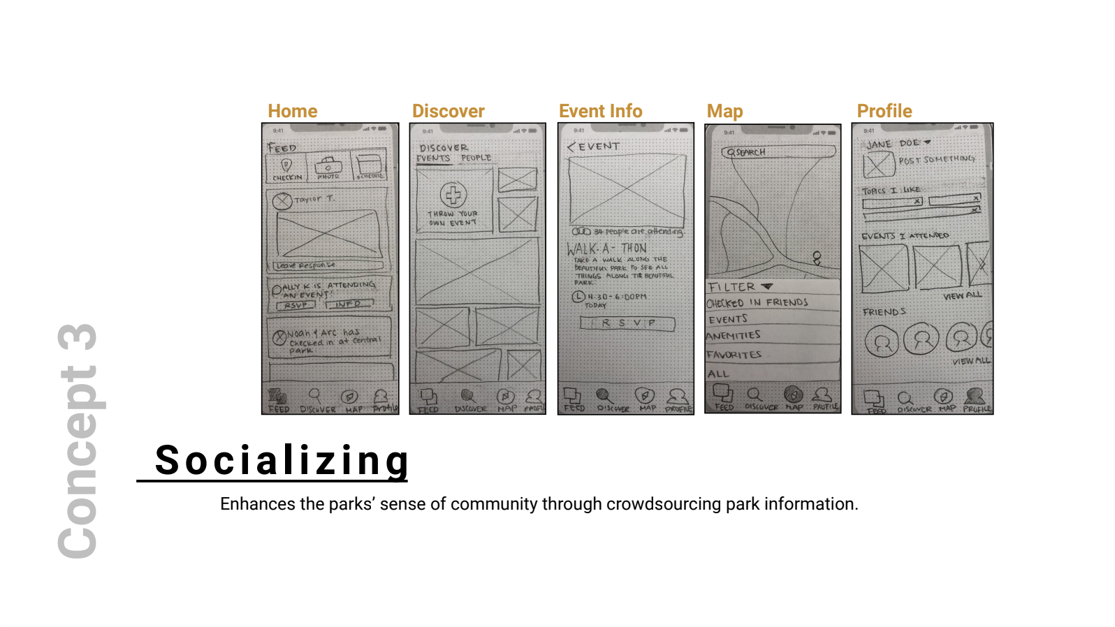
The third concept addressed increasing awareness of issues and events through a platform which mimicked social media. With this concept, problems that emerged in parks were envisioned to be brought out into the spotlight instead of being brushed aside, and would be solved through the power of crowdsourcing.
We tested both concepts and the users loved the idea of a game and also held the map concept in high regard because of its perceived usefulness. The third concept was not met with much enthusiasm and was dropped for the purpose of preventing our product from becoming too general.
It was time to bring the ideas we made on paper into a testable prototype that could be interacted with on users' phones.
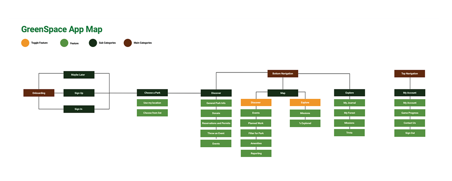
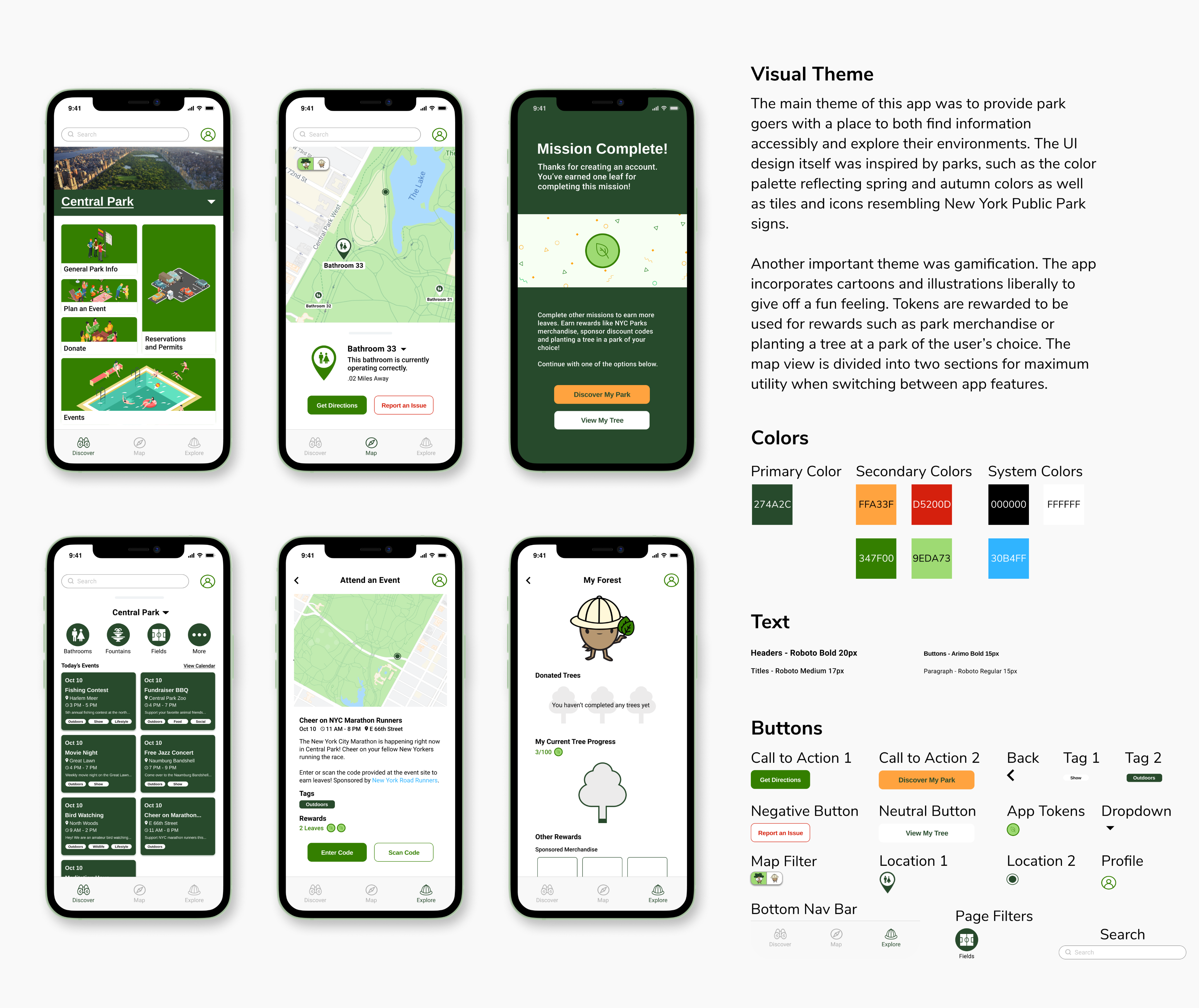
Because of positive feedback to both concepts and the fact that we believed the two complemented each other well, we decided to combine the concepts in our MVP. They would exist as two modes, Discover and Explore, which could be switched through a toggle button.
Expanding on our concepts and cognizant of user needs we added the following features:
A new clear and concise onboarding flow to orient users on features.
Content now placed in digestible card format to prevent cognitive overload.
Progress to goal bar shown on the app as a gamification feature to foster engagement.
Several questions came to mind when it came to building tasks and evaluating the effectiveness of our prototype:

Find a restroom in Discover Mode and report an issue with it.
Switch to explore mode and earn points through a mission.
Find information on amenities at another park for future visits.
The test results were positive and showed much promise for Green Space. Users thought that the two concepts fit well together within the app and they also found that the concept was helpful in their everyday lives.

Of users completed all tasks.
The average ease of use rating.
The average helpfulness rating.
One common user criticism was that the toggle function was not immediately clear in its purpose. My team believed that such a crucial part of the product should be explained clearly, and we considered either changing the icon or elaborating on the function in onboarding.
An interesting user suggestion noted the fact Green Space seemed more suited to big parks like Central Park. They were curious to see how our platform would include smaller parks. We considered this a future recommendation to explore, along with reaching a wider audience of occasional or infrequent park goers as well as developing a plan to ensure government collaboration when it came to planting trees.
Another important suggestion that came up after the initial research and testing phase was how Green Space could accomodate more people with physical or mental impairments. Given how important accessibility is to recreational activities, exploring ways to improve inclusivity would be on the top of the list of future updates.
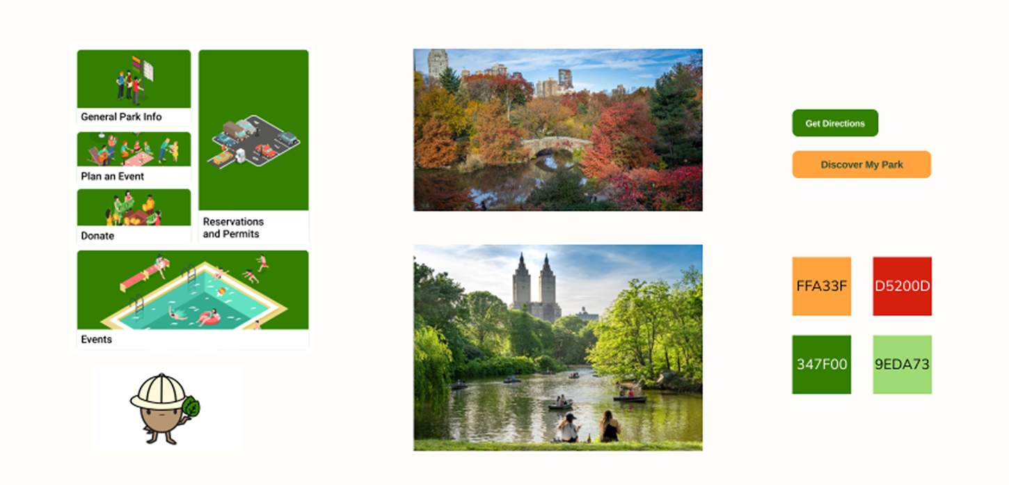
With Green Space, I was truly able to connect product design with real world scenarios. What is the root cause of user pain points? What are the implications of the root cause? This project allowed me to think bigger in the truest sense and develop a solution that was not only enjoyable but also cut inefficiencies and find a way to give back to the community.
Coming from an economics background, I enjoyed the idea of finding out how to optimize user's ability to enjoy the park through incentives. I also enjoyed finding ways to connect park-goer apathy to the state of the public parks. I believe that this application of systems theory goes hand in hand with design, and it excites me to undertake a journey into this new but also strangely familiar world.
I hope to become able to apply myself and my previous experiences with my newfound design skills and bring these two together in my future endeavors. I sincerely hope to be able to bring something like Green Space into existence for the benefit of all of society.
