If the NYPL already had resources for job seekers that were not being sufficiently utilized, then what could we do to draw those people in?
To start our process of answering this question, my team took a look at competitors within the career enrichment space, particularly sites like LinkedIn and Lynda. We did this to gain some insight on why these sites were successful and how we could seek to emulate them.
From our competitive analysis, we drew the conclusion that these sites were successful due to certain key factors:
To best inform our prototype, we developed five design principles to supplement our product statement. Created with the user persona in mind, we would use these principles to guide the features of NYPL Advance.
Credible
Familiar
Delightful
Hospitable
Empowering
We decided to user test the paper concepts with a focus group before moving on to the MVP.
Our paper prototype received positive feedback from the focus group. The suggestions we received mostly focused on visual optimization and we incorporated these moving forward in our mid-fidelity prototype of NYPL Advance.
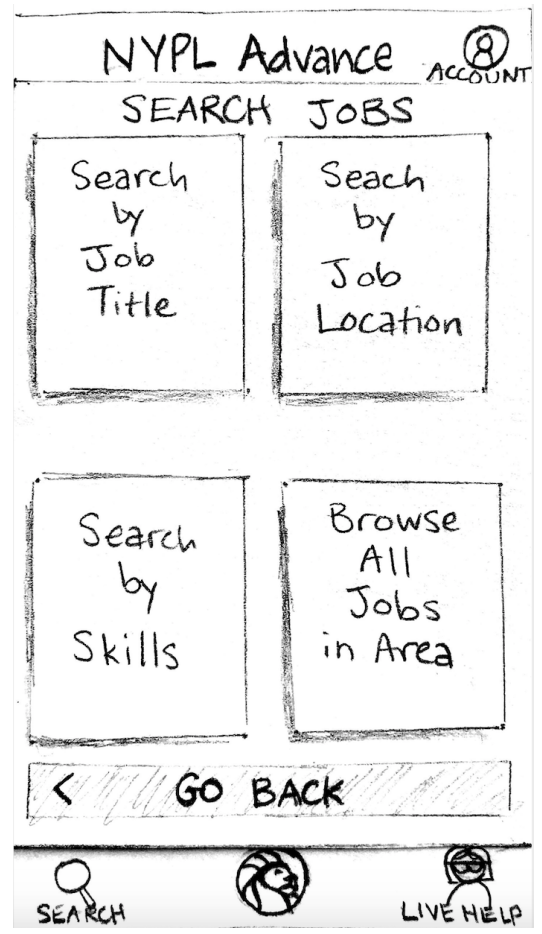
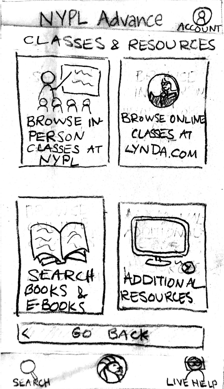
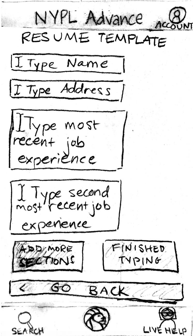
Task 1
Task 2
Task 3
The results for the test came in and were mixed. Our users stated that while they found the design to intuitive to understand and easy to use, they were not as sold on the helpfulness of NYPL Advance for actually finding a job. Additionally, two users had trouble completing every task, and this could be attributed to unclear directions during the test.
60%
4.4/5
3.8/5
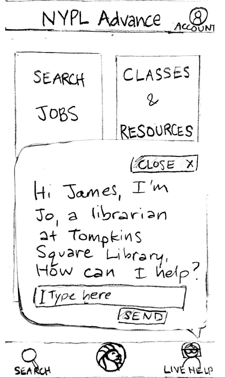
Notable critiques from users were that quizzes seemed to have a disconnect from the rest of the app and that participants did not find the swipe interaction intuitive causing a high degree of confusion during on-boarding.
To combat issue #1, we thought of creating clickable links in quiz results so users can learn more about the answers and their relevance to job searching and advancement.
To combat issue #2, we thought of placing the word swipe on the page to make it more understandable for clear instructions on swiping.
Through this project, I learned to always keep an eye out for underlying problems that users have may not be obvious from the surface and require extra digging. There were many moments that took me out of my comfort zone, such as testing with an age group that I was not familiar with.
The biggest challenge was making an app for a demographic that professed being technologically illiterate. The core issue with our product was that our tested users were confused about the task flow as well as how the features tied into the idea of finding a job.
My team tried to create a design that simplified the user's journey using the product through spacious and simple visual design as well as live chat to help ease uncertain users. I now realize that I should have spent just as much effort on the onboarding process, getting users comfortable with the idea of using the app to aid their job search, and being more upfront with results rather than process.
Working on NYPL Advance was a welcome challenge. Though the results of the product did not meet expectations, I took this defeat as an opportunity to learn from my mistakes and reevaluate myself as a designer. In my future work, I plan to implement a stronger research and planning process that effectively uncovers nuanced user behavior.

 Bebe Voyage